MOBILE INSIGHTS FOR BETTER EXPERIENCE
In the dynamic digital realm, mobile responsiveness is not just a feature but a vital necessity. At CREANTE, we understand the pivotal role it plays in crafting seamless user experiences. Let’s explore some insights on how we can elevate your digital presence through mobile responsiveness.
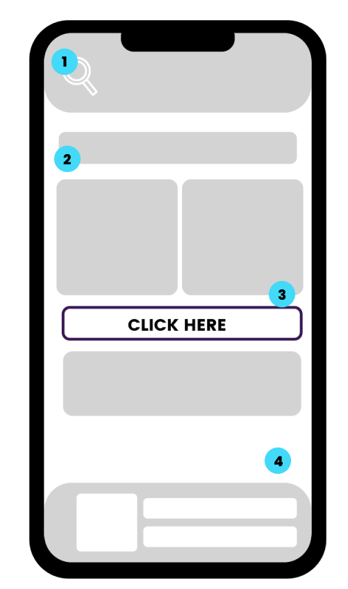
Ensure a visually accessible webpage with a prominent full search bar. Elevate aesthetics and empower users to efficiently find information.
Craft a user-friendly mobile experience by aligning content vertically. Optimize screen real estate, emphasising essential information and eliminating clutter.
Elevate user engagement with a well-positioned call to action. Guide users seamlessly without extensive searching, enhancing overall effectiveness.
Reduce mobile footer size for a clean interface. Ensure essential navigation and contact details are concise, contributing to a visually appealing design.